


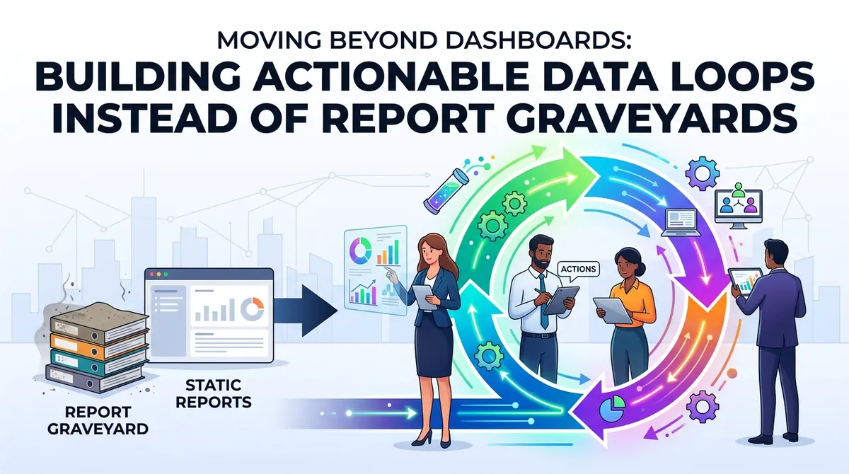
Almost every modern enterprise suffers from the same quiet epidemic: the report graveyard.
Organizations invest hundreds of thousands of dollars in advanced business intelligence platforms, data warehouses, and visualization tools. They spend months architecting gleaming dashboards with pristine color palettes, real-time filters, and executive summaries. Yet, when you look beneath the surface, these dashboards function more like digital mausoleums than operational engines—visited once a week for a status meeting, admired for their design, and completely disconnected from actual day-to-day business decisions.
The root cause isn't bad data, and it isn't poorly trained analysts. The fundamental flaw lies in our relationship with the dashboard itself. We treat data consumption as a passive destination when it should be an active loop.
1. The Anatomy of a Report Graveyard
Why do beautiful dashboards fail to drive business outcomes? It usually comes down to three structural failure modes:
- Information Overload and Vanity Metrics: Dashboards often try to serve everyone at once. When a single screen attempts to display high-level corporate revenue alongside granular campaign-level clickthrough rates, it becomes useless to everyone. Executives drown in noise, while operators get no actionable clarity.
- The "Lagging Indicator" Trap: Most traditional dashboards focus exclusively on backward-looking metrics—monthly churn, last month's ROAS, or quarterly sales totals. By the time a downward trend surfaces on a historical report, the operational fire has already been burning for weeks.
- The Lack of an Operational "Next Step": A dashboard tells a user what happened, but it rarely dictates who needs to do what about it. Without a direct bridge between insight and execution, data remains an abstract observation rather than a catalyst for change.
To move beyond the graveyard, organizations must stop building static portals for viewing data and start architecting actionable data loops.
2. Shifting from Static Dashboards to Actionable Data Loops
A data loop is fundamentally different from a traditional dashboard pipeline. Where a dashboard is a dead-end street (Data → Visualization → Human eyeballs → [Optional Action]), a data loop is a continuous, self-optimizing circuit where insights automatically trigger workflows, test hypotheses, and feed back into the system.
This architecture operates across three continuous phases:
- 1Contextualized Alerting (Signal over Noise): Instead of forcing teams to log into a tool to check if metrics look normal, the data infrastructure should monitor anomalies in real time and push contextual alerts directly into operational channels (such as Slack or automated project management boards) complete with diagnostic breakdowns.
- 2Automated Operational Triggers: High-frequency decisions shouldn't wait for human analysis. When specific thresholds are met—such as a sudden spike in customer acquisition cost on a specific ad set or an unexpected drop in server-side event match quality—the system should automatically adjust bidding rules, flag inventory issues, or trigger retention workflows.
- 3Hypothesis-Driven Feedback Loops: For strategic decisions, data should prompt structured experiments (like incrementality holds or creative variations) whose results automatically repopulate the decision matrix for the next planning cycle.
3. Redesigning Metrics for Operators, Not Just Executives
Building an actionable data loop requires completely rethinking how metrics are structured across different layers of the organization.
A. Executive Metrics: The High-Level Compass
Executives do not need 50-variable drill-down filters. They need high-velocity, high-integrity guardrail metrics: Blended CAC, Contribution Margin, Net Revenue Retention, and Cash Flow Velocity. These numbers indicate the health of the vessel, not the angle of every individual oar.
B. Operator Metrics: The Diagnostic Dashboard
Media buyers, product managers, and customer success leads need granular, leading indicators tied directly to levers they can pull within the hour. For a growth team, this means tracking real-time server-side conversion latency, funnel drop-off anomalies, and creative fatigue indices rather than waiting for monthly attribution reports.
4. Operationalizing the Loop: A Blueprint for Teams
If you want to dismantle your report graveyards and build an active data loop, follow this implementation sequence:
- 1Conduct an Audit of Usage: Track which dashboards haven't been actively queried or shared in the last 60 days. Do not be afraid to deprecate them. If a report doesn't influence a recurring workflow or decision, it is digital clutter.
- 2Embed Insights Where Work Happens: Move intelligence out of standalone BI tools and into the operational software your teams already use daily—whether that is CRM systems, ad managers, or project management suites.
- 3Tie Every Report to an Action Protocol: Before writing a single line of SQL or building a new chart, answer this mandatory question: If metric X drops by 15%, exactly who takes action, and within what timeframe? If you cannot answer that question, the chart has no business existing.
Conclusion
Data is only as valuable as the velocity of the action it inspires. When organizations treat data as a monument to be admired on a screen, they build report graveyards that consume resources without driving growth.
By shifting our engineering and strategic focus toward actionable data loops—systems designed to alert, automate, and close the gap between insight and execution—we transform data from a passive historical record into an active competitive advantage. In a fast-moving market, the winner isn't the company with the prettiest charts; it's the one whose data engine moves the fastest.