


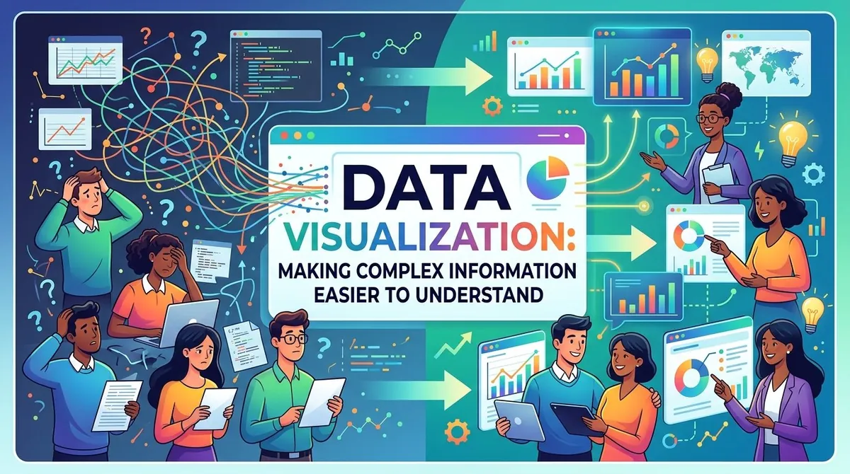
Businesses generate information from sales, customers, marketing campaigns, financial systems, and daily operations. While this data can provide valuable insights, large amounts of numbers and tables can make important patterns difficult to recognize.
Data visualization helps transform complex information into charts, graphs, dashboards, and other visual formats. By presenting data in a more accessible way, organizations can identify trends, compare results, recognize unusual changes, and communicate insights more effectively.
What Is Data Visualization?
Data visualization is the process of representing information visually so that patterns and relationships can be understood more easily.
Instead of reviewing hundreds of rows in a spreadsheet, a business might use a line chart to show revenue over time or a bar chart to compare sales across different products.
The purpose is not simply to make information look more attractive. Effective data visualization for business should make relevant information easier to interpret and help people focus on the patterns that matter.
Why Data Visualization Matters
Large datasets can contain useful information that is difficult to recognize when presented only as text or numbers. Visual representations can make differences, trends, and relationships more apparent.
For example, a business monitoring monthly revenue might identify gradual growth in a table. A line chart can make the same trend immediately visible.
Visualization can also help teams compare business performance across products, regions, customer groups, or time periods. This can support faster analysis and provide decision-makers with a clearer view of current conditions.
Choosing the Right Visualization
Different types of data require different visualization methods.
Bar charts can be useful for comparing categories, such as sales across products or revenue across regions.
Line charts are commonly used to display changes over time, such as monthly revenue, website traffic, or operating costs.
Pie or doughnut charts can show the composition of a whole when there are only a small number of meaningful categories.
Scatter plots can help illustrate relationships between two numerical variables, such as advertising expenditure and sales.
Dashboards can combine several visualizations to provide an overview of important business metrics in one place.
Selecting the appropriate format helps ensure that the visualization communicates the intended message without creating unnecessary complexity.
Making Business Data Easier to Understand
Effective visualization depends on more than selecting a chart type. The information needs to be presented clearly and consistently.
Titles and labels should explain what the audience is seeing. Scales should accurately represent the underlying data, while unnecessary visual elements can be removed to keep attention on the most important information.
Businesses should also avoid presenting too many metrics at once. A dashboard containing dozens of charts may provide a large amount of information while making it difficult to determine which indicators actually require attention.
The objective of data visualization tools should therefore be clarity rather than decoration.
Data Visualization and Decision-Making
Visualization plays an important role in data-driven decision-making because it can connect analytical results with practical business questions.
Consider a company experiencing lower sales. A dashboard could show sales trends by product, region, customer segment, and marketing channel. Decision-makers can then investigate where the largest changes occurred and determine whether additional analysis is necessary.
Visualization can also help organizations monitor key performance indicators on an ongoing basis. When relevant metrics are updated regularly, teams can identify changes and evaluate whether business activities are producing the expected results.
This makes visualization useful not only for reporting past performance but also for monitoring current business conditions.
Implementation Roadmap and Best Practices
Organizations can improve their use of business data visualization by following several basic principles:
- Start with a question: Determine what the audience needs to understand before selecting a chart.
- Use relevant data: Include information that directly supports the question being addressed.
- Choose the appropriate format: Match the visualization to the type of comparison, trend, or relationship being examined.
- Keep the design clear: Remove unnecessary elements that distract from the main message.
- Provide context: Include useful labels, time periods, units, and comparisons.
- Review regularly: Update dashboards and visualizations when underlying business conditions or reporting requirements change.
These practices can make dashboards and reports more useful for both analysts and non-technical decision-makers.
Common Challenges
Poorly designed visualizations can make information harder to understand rather than easier.
One common problem is information overload. Including too many charts, metrics, or categories can overwhelm the audience and make important findings difficult to identify.
Misleading scales or inappropriate chart types can also distort how information is interpreted. Visualizations should accurately represent the underlying data and avoid creating impressions that the numbers do not support.
Another challenge is data quality. A visually appealing dashboard cannot compensate for inaccurate, incomplete, or inconsistent information.
Organizations should therefore treat visualization as part of a broader analytics process that includes reliable data collection, analysis, and interpretation.
The Future of Data Visualization
Advances in cloud analytics, artificial intelligence, and interactive business intelligence platforms are changing how organizations work with visual data.
Modern business intelligence tools can connect information from multiple sources and allow users to explore metrics interactively. Automated analytics can also help identify unusual changes or patterns that may require further investigation.
As organizations collect more information, the ability to communicate that information clearly becomes increasingly important. Data visualization can provide a bridge between complex datasets and the people responsible for making business decisions.
Ultimately, effective visualization does not replace analysis. It makes analysis easier to understand and communicate. When supported by reliable data and appropriate analytical methods, visualization can help businesses recognize patterns, monitor performance, and turn complex information into actionable business insights.
References
- Microsoft. "What Is Data Visualization?"
- IBM. "What Is Data Visualization?"
- Microsoft. "What Is Business Intelligence?"
- IBM. "What Is Business Analytics?"
- Tableau. "What Is Data Visualization?"
- Harvard Business Review. "The Rise of Data-Driven Decision Making Is Real but Uneven."